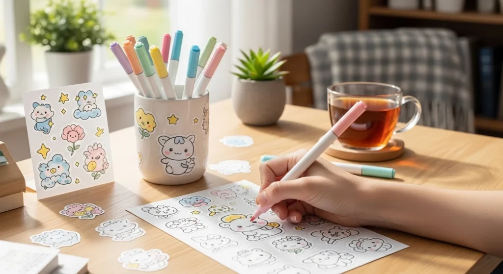
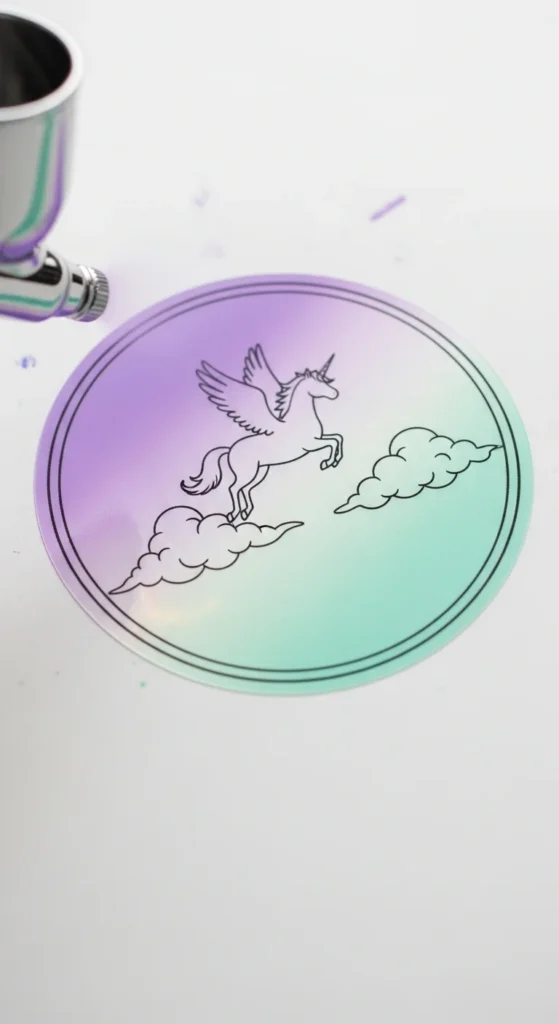
There’s something seriously satisfying about turning a plain sticker into a soft, dreamy, aesthetic masterpiece. Whether you’re decorating your journal, laptop, or planner, the way you color your stickers can completely change the vibe—think pastel gradients, clean blends, and that trendy “Pinterest-perfect” finish.
If your stickers sometimes look patchy, too harsh, or just not quite right, don’t worry—you’re about to level up your coloring game.
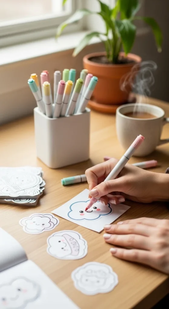
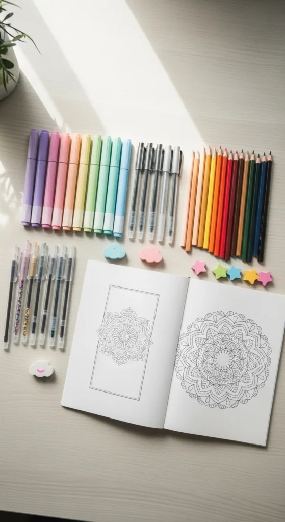
✨ Choose the Right Coloring Tools
Before you even start coloring, your tools make all the difference. Not every pen or marker will give you that smooth, aesthetic look.
Here’s what works best:
- Alcohol markers – perfect for seamless blending
- Mildliners or brush pens – great for soft, muted tones
- Colored pencils – ideal for subtle shading and texture
- Gel pens – amazing for highlights and tiny details
💡 Tip: If you want that trendy pastel aesthetic, stick to light, desaturated colors instead of bold, neon shades.
🎨 Start with a Light Base Layer
One of the biggest mistakes? Going in too dark, too fast.
Instead:
- Begin with a very light layer of color
- Use soft strokes and minimal pressure
- Build up the color gradually
This technique helps avoid streaks and gives you more control over the final look.
💡 Think of it like skincare—you layer slowly for the best results.
🌈 Blend for That Smooth Finish
Blending is where the magic happens. This is how you get that soft, aesthetic gradient effect.
Try these simple blending methods:
- Alcohol markers:
Use a lighter shade over a darker one while it’s still wet - Colored pencils:
Layer multiple light colors and blend with a white pencil - Brush pens:
Use a slightly damp brush or blender pen for smoother transitions
💡 Work quickly when using markers—they blend best before drying.
💖 Add Depth with Soft Shading
Flat coloring can look a bit lifeless. Aesthetic stickers usually have soft shadows that add dimension.
Here’s how to do it:
- Pick a slightly darker shade of your base color
- Add shading:
- Around edges
- Under folds or curves
- Near outlines
- Blend gently so it doesn’t look harsh
💡 Keep shading subtle—the goal is soft and dreamy, not dramatic.
✨ Highlight for That Trendy Glow
Highlights are what give your stickers that polished, almost glossy finish.
Use:
- White gel pens
- Light pastel tones
- Even a tiny bit of glitter (optional!)
Add highlights:
- On curved surfaces
- Along edges where light would hit
- As tiny dots for a cute, playful effect
🧠 Stick to a Color Palette
Aesthetic = cohesive.
Instead of using random colors, choose a palette before you start:
- Pastel pink + lavender + cream
- Sage green + beige + soft brown
- Baby blue + white + light gray
This instantly makes your stickers look more intentional and trendy.
💡 Save color palettes from Pinterest for inspiration—you’ll never run out of ideas.
🖌️ Clean Edges = Clean Look
Even the prettiest colors won’t shine if the edges are messy.
To keep things neat:
- Use fine-tip pens for tight areas
- Color toward the outline, not away from it
- Rotate your paper instead of your hand for better control
💡 Slow down around edges—it’s worth it.
🌟 Final Touches That Make a Difference
Want your stickers to look extra aesthetic? Don’t skip the finishing details:
- Add tiny sparkles or dots
- Outline lightly with a darker tone
- Layer soft textures with pencils
- Use washi tape or backgrounds when displaying
💬 Final Thoughts
Coloring aesthetic stickers isn’t about perfection—it’s about creating something soft, expressive, and uniquely yours. With the right tools, gentle layering, and a bit of blending magic, you can turn even the simplest sticker into a Pinterest-worthy piece.
So grab your markers, pick your palette, and start creating ✨
Save this guide for later and come back whenever you need a little creative boost! 🎨💖