Ever scroll through Pinterest and wonder how those perfectly polished stickers look so effortlessly beautiful? The truth is—creating aesthetic stickers with a clean, professional finish isn’t about expensive tools. It’s about thoughtful design, consistency, and a few insider tricks.
Whether you want to decorate your journal, sell digital stickers, or upgrade your brand visuals, this guide will walk you through everything step by step.
✨ Start with a Clear Design Vision
Before you open any design app, pause and think about your style. Aesthetic stickers aren’t random—they follow a vibe.
Ask yourself:
- Do I want minimalist, cute, or vintage?
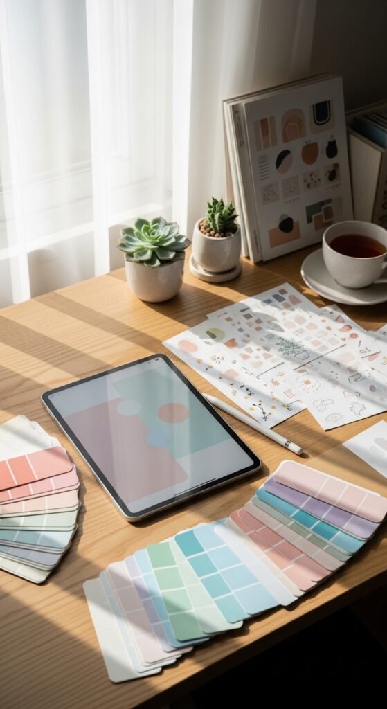
- What color palette matches my theme?
- Will my stickers be bold or soft and subtle?
💡 Tip: Stick to 3–5 colors max. Too many shades can make your design look cluttered.
Popular aesthetic styles:
- Pastel kawaii
- Neutral minimalist
- Retro 90s
- Botanical/earthy
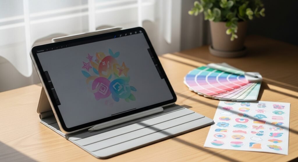
🎨 Choose the Right Tools
You don’t need fancy equipment, but having the right tools helps you achieve that clean, pro finish.
Best tools for beginners:
- Drawing apps (tablet): Procreate, ibisPaint
- Desktop design tools: Canva, Adobe Illustrator
- Free options: Krita, Inkscape
Focus on tools that allow:
- High-resolution export (300 DPI)
- Transparent backgrounds
- Smooth brush control
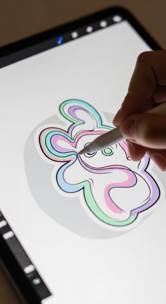
✍️ Create Clean and Simple Artwork
The secret to professional-looking stickers? Clean lines and intentional design.
Keep these tips in mind:
- Use smooth, consistent brush strokes
- Avoid overcrowding your design
- Keep shapes clear and easy to recognize
✔ Less is more. A simple heart, flower, or quote often looks better than an over-detailed illustration.
💡 Pro Tip: Zoom in and refine edges. Jagged lines are the fastest way to make a design look amateur.
🌈 Master Color and Contrast
Color is what makes your sticker pop—or fall flat.
Here’s how to get it right:
- Use soft gradients for depth
- Add subtle shadows or highlights
- Ensure enough contrast between elements
For example:
- Light background? Use darker outlines
- Neutral palette? Add one accent color
Avoid overly saturated colors unless that’s your theme. Aesthetic designs usually lean toward soft, pleasing tones.
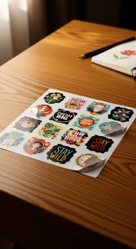
🔲 Add a Clean Sticker Border
That crisp white border you see around stickers? It’s not just decorative—it defines the design.
Steps to create it:
- Duplicate your artwork layer
- Expand the shape slightly
- Fill it with white (or a soft neutral tone)
Keep the border:
- Even on all sides
- Not too thick or too thin
🧼 Keep It High Quality (Resolution Matters!)
Blurry stickers = instant turn-off.
Always design in:
- 300 DPI resolution
- Large canvas size (at least 2000px wide)
Export formats:
- PNG (for transparent background)
- PDF (for printing sheets)
💡 Tip: Even if your sticker is small, designing big ensures sharp details when resized.
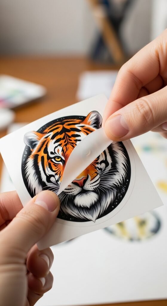
✂️ Test Print for a Professional Finish
If you plan to print your stickers, testing is key.
Things to check:
- Are colors accurate?
- Are lines sharp?
- Is the border clean?
Use:
- Matte sticker paper for a soft aesthetic
- Glossy paper for vibrant, shiny designs
Optional upgrade:
- Waterproof vinyl for durability
💡 Bonus Tips for That “Wow” Factor
Want your stickers to stand out instantly? Try these:
- Add subtle textures (paper grain, noise effect)
- Use cohesive themes (e.g., all floral, all quotes)
- Create sticker packs instead of single designs
- Keep spacing balanced between elements
✨ Small details make a big difference.
🚀 Final Thoughts
Designing aesthetic stickers with a clean, professional finish is a mix of creativity and precision. Once you master clean lines, balanced colors, and proper formatting, your designs will instantly look more polished and eye-catching.
Start simple, stay consistent, and don’t be afraid to experiment with your style.
💾 Save this guide for later and start designing your own beautiful stickers today!